Do you know what the following words mean?
- Kerning
- Triadic
- Skeuomorphism
- Knolling
It's like learning a new language, isn't it? Welcome to the world of design!
With so many technical design terms thrown around, life can get a little confusing for a marketer with no design background. But fear not – we are here to help.
But you may be thinking – Why is it so important to know these design terms?
It's because of the impact visual content has on social media.
Visual content gets you more attention on social media. According to Buffer, visual content is 40x more likely to be shared on social media than other types of content. As a result, marketers must at least have a basic knowledge of design terms.
You no longer need expert (and expensive) designers to create well-designed images. We have tools such as Canva and Pablo by Buffer to help us in our pursuit. Both these tools require no prior design experience for marketers to create beautiful visuals that are more share-worthy on social media.
That being said, it's always helpful when you have a deeper understanding of design to help you in your marketing efforts. Basic knowledge of design terms will also enable you to use tools such as Canva and Pablo to their maximum potential.
If you're ready to take your design game to the next level, here is a glossary of key design terms every marketer should know.
Table of Contents
54 Key Design Terms Every Marketer Should Know
Colors
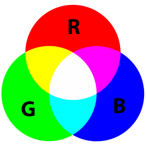
1. RGB – RGB stands for 'Red, Green, and Blue'. The RGB color model adds red, green, and blue light together in different ways to create a broad array of colors.
2. Color Palette – A color palette represents colors that can be utilized for any design work that represents your brand. The colors should be used harmoniously with each other to design your visuals.
3. Color Theory – The study of how colors make people feel and respond. It's a theory which states that certain colors evoke certain subconscious emotions and feelings in people. For instance, the color blue evokes feelings of trust and dependability. Have you ever wondered why social media brands such as Facebook, LinkedIn, Twitter, etc. use different shades of blue in their logo? This is why!
4. Warm colors – Warm colors give a friendly and cheerful vibe. These colors are red, orange, yellow, and various combinations of these colors.
5. Cool colors – Cool colors include blue, green, and light purple. They have a calming and soothing effect.
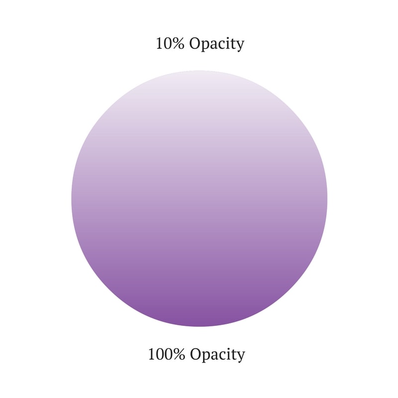
6. Opacity – The degree of transparency of an element. The lower the opacity, the more transparent the color.
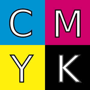
7. CMYK – CMYK stands for 'Cyan, Magenta, Yellow, Key.' CMYK is a color model which is used for print purposes.
8. Gradient – Gradient refers to a gradual change in color from one tone to another.
9. Hue – A hue is a way to describe a color and it could be any color on the color wheel. For example, red, blue, and yellow are all hues.
10. Tint – A tint is a variety of a color. Tints are created when you add white to any hue on the color wheel.
11. Monochrome – Monochrome is an image created in black and white or in varying tones of only one color.

12. Complementary – Colors that are opposite each other on the color wheel are considered to be complementary colors. Example: Orange and Blue.
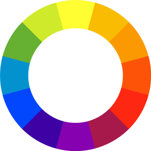
13. Triadic – A triadic color scheme uses colors that are evenly spaced around the color wheel. For instance, the Burger King logo follows a triadic scheme by using the colors orange, red, and blue. Check these colors on the color wheel above and you'll notice they are evenly spaced.
14. Analogous – Analogous color schemes use colors that are next to each other on the color wheel. Example: Green, yellow, and orange.

15. Pantone – Under Pantone Matching System (PMS), every hue is given a number, making it easy for people to reference and reproduce the same colors.
Typography
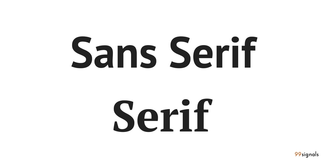
16. Serif typeface – A serif typeface adds a little extra stroke or curves, at the ends of letters. (See example below)
17. Sans serif typeface – "Sans" literally means "without", and a sans serif font does not include an extra stroke at the ends of the letters.
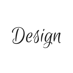
18. Script typeface – A typeface that mimics cursive handwriting. Example: Euphoria script.
19. Monospace – A font whose letters and characters each occupy the same amount of horizontal space.
20. Hierarchy – The visual arrangement of design elements in a way that signifies importance. A typical hierarchy of a blog post would be heading, subheading, paragraph, etc.
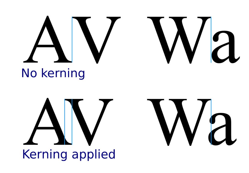
21. Kerning – Kerning refers to the space between two specific letters. Kerning usually aims to achieve a pleasing balance of space between each character which improves its legibility.
22. Leading – Leading determines how text is spaced vertically in lines. Tight leading can cause tension and overlap, making the content unreadable, and loose leading can make the type appear disjointed, so we need to try to find a neat balance between the two.
23. Tracking – Tracking is similar to kerning in that it refers to the spacing between characters. However, instead of focusing on the spacing between individual letters, tracking measures space between groups of letters.
24. X-height – X-height is the average height of lowercase letters. X-height gets its name as this value is usually determined by looking at the height of the letter x in any given typeface.
25. Orphans and Widows – The words that appear by themselves at the top or bottom of a column of type. It's always a good idea to remove these orphans and widows to improve the readability and legibility of the copy.
26. Lorem Ipsum – Lorem Ipsum is a dummy text used by the design industry. It's usually used as a placeholder text within designs when the copy isn't ready.
27. Body copy – The main part of text in your design – the written website content, the book contents, etc.
28. Pull quote – A short quote pulled from the main text and used as a visual element to highlight important text or draw attention to the piece. Pull quotes are common in newspaper and magazine design.
29. Legibility – The measure of how easy it is to distinguish one letter from the next. It has a lot to do with your choice of typeface.
30. Alignment – The lining up of elements to achieve balance and order. There are four common types of typographical alignment – center, left, right, and justified.
Branding and Logos
31. Logotype – A logotype is a type of logo where the name of the company is designed in a visually unique way. Example: The Coca-cola logo.

32. Logo mark or Brandmark – A logo where a symbol is used instead of the company name. Ex: The Apple logo.

33. Brand identity – The visualization of your brand in a way that represents the company's values and ethos. This can include things like a logo, business cards, letterheads, packaging design, etc.
34. Style guide – A style guide is a set of standards for the design of anything related to your brand, whether it's a website, flyer, ad banner, or business cards. A style guide ensures complete uniformity in style and formatting wherever the brand is used to avoid dilution of the brand.
35. Grid – A grid is constructed from evenly divided columns and rows. A grid allows designers to arrange elements in a consistent way.
36. Icon – Icons are symbols used to represent an action or an object.
Design Techniques
37. Knolling – Knolling is the act of arranging different objects so that they are at 90-degree angles from each other, then photographing them from above. This technique creates a very symmetrical look that looks visually appealing. Images that feature knolling are usually set against a contrasting solid background.
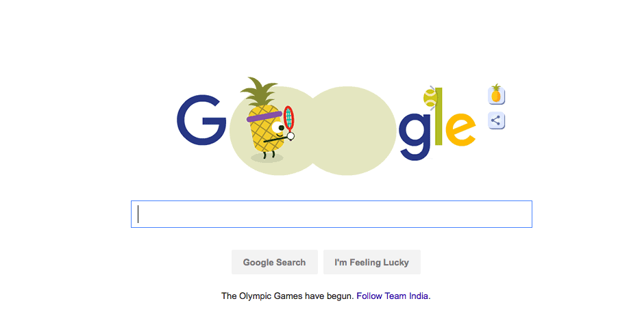
38. Whitespace – Whitespace (also called negative space) refers to the area of a design left blank. It's the space between graphic elements or copy on the page. Despite being called white space, it can be any color. An excellent example of whitespace would be the Google homepage. By utilizing whitespace, Google makes you focus more on its search bar than any other element on the page.
39. Resolution – The resolution of an image determines the quality. As a rule of thumb, the higher the resolution, the higher the quality.
40. Contrast – Contrast occurs when two elements on a page are different. Some common types of contrast are dark vs. light, thick vs. thin, rough vs. smooth, etc.
41. Saturation – Saturation refers to the intensity or vividness of a color. The more saturated a color is, the more vivid or brighter it appears.
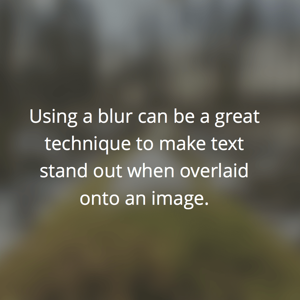
42. Blur – Blur makes images more unclear or less distinct. Using a blur can be a great technique to make text stand out when overlaid onto an image.
43. Crop – The process of discarding the unnecessary portions of an image is called cropping.
44. Texture – A texture is defined as the surface characteristics of your image.
45. Aspect Ratio – An aspect ratio is the proportional relationship between the width and height of a rectangle.
46. Pixel – The word 'pixel' is derived from the 'picture element.' Pixels are the smallest basic unit of programmable color on a computer and images are made up of many individual pixels.
47. Skeuomorphism – Skeuomorphism is when a digital element is designed to look like a replica of the physical work. For example, the calculators on our smartphones are made to look like their real-life counterparts.
48. Flat design – Flat design is a minimalistic approach that focuses on simplicity and usability. It tends to feature plenty of open space, crisp edges, bright colors, and two-dimensional illustrations.
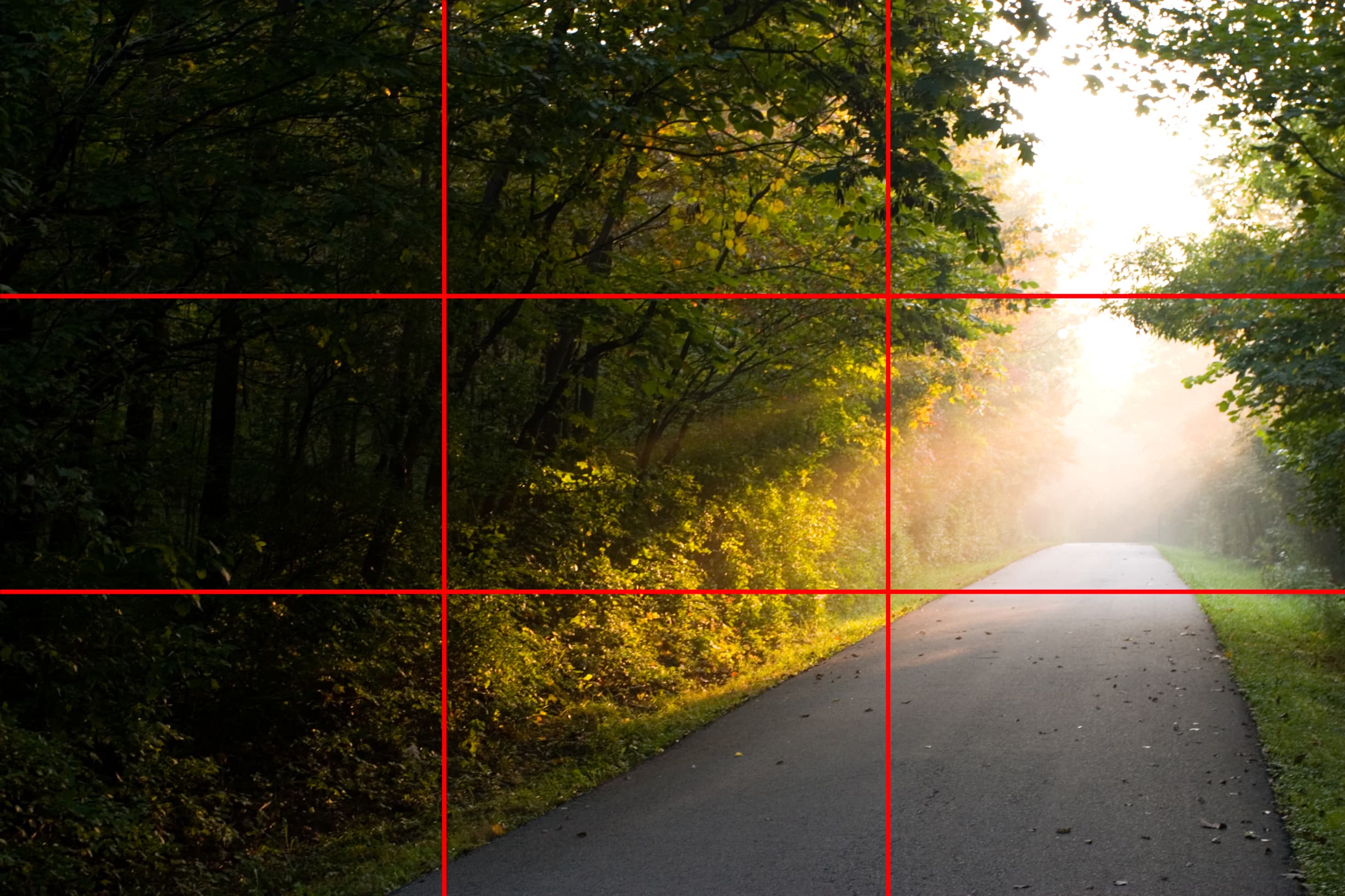
49. Rule of Thirds – Rule of Thirds is a theory that if you divide your image with two vertical and two horizontal lines, the areas where your lines intersect will become focal points of your design.
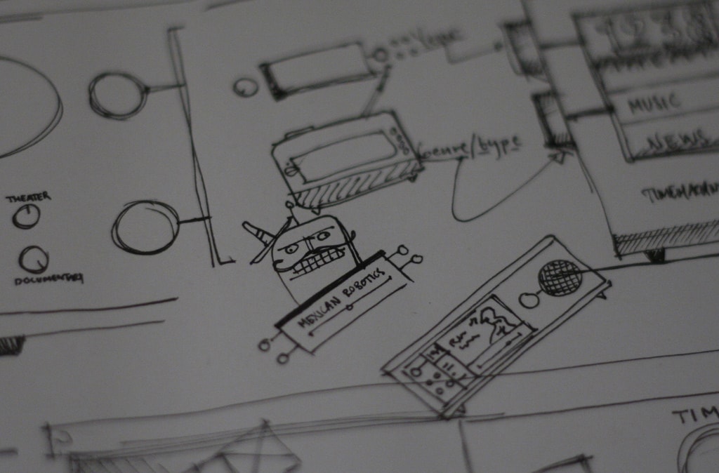
50. Thumbnail Sketches – Thumbnail sketches are rough drawings of potential design concepts or solutions. These sketches are used to visualize ideas and concepts by hand before they're brought to the screen.
51. Die Cut – The process of cutting areas of your printed design in various shapes to create unique effects.
52. Foil Stamping – The heat-pressing application of foil to certain parts of a design to give them a shiny, metallic finish.
53. Letterpressing – The process of using metal plates to press a design into the surface of paper to create dimensional indentations.
54. Scale – Scale refers to the size of an object in relationship to another object. Two elements of the same size can be seen as being equal. On the other hand, elements with a clear variation in size tend to be seen as different.
We hope you found these design terms and their definitions helpful. These terms will really come in handy when you're adding design to images using Canva or Pablo.
Related Articles



Nice article, are both the typeface examples Serif though?
Indeed they are! Thanks for noticing, Conrad. I've replaced the image now.
[…] With so many technical design terms thrown around, life can get a little confusing for a marketer with no design background. Here are 54 design terms every marketer should know. […]